
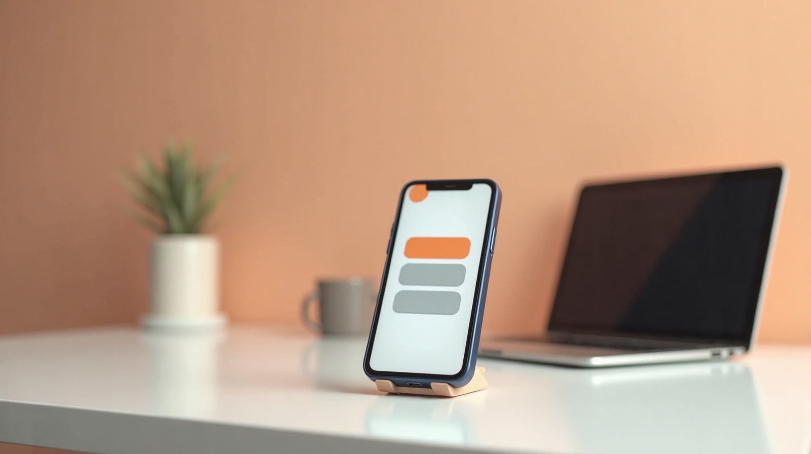
When most people picture their website, they picture it on a laptop, a wide screen, everything laid out neatly, lots of room. That's the version they sign off on. But it's not the version most of their customers will ever see.
Your customers are on their phones. They found you through Instagram, a Google Maps search, or a text from a friend, and they tapped the link with their thumb while standing in line somewhere. The phone isn't the backup view of your site. For most visitors, it's the only view.
What "mobile-first" actually means
Mobile-first means the site is designed for a small screen first, then opened up for bigger ones, instead of the other way around. It sounds like a small detail. It's not. When you design for a laptop and shrink it down later, the phone version always ends up feeling like a cramped afterthought. When you design for the phone first, the phone version is the real thing, and the laptop just gets more breathing room.
Since the phone is where most of your visitors are, the phone version is your website. Everything else is a bonus.
How many people are really on a phone?
For most small businesses, more than half of all website visitors are on a phone, and for plenty of them it's well over 60 percent. Think about how people actually find you: a link in your Instagram bio, a tap from Google Maps, a screenshot a friend sent. Every one of those journeys happens on a phone. The laptop visitor is now the exception, not the rule.
What breaks on a small screen
A site that wasn't built for phones tends to fall apart in the same predictable ways:
- Text too small to read. The visitor is pinching and zooming just to make out your hours. Most won't bother.
- Buttons crammed together. When tap targets are too small or too close, people hit the wrong one, get frustrated, and leave.
- Images that spill off the screen. A photo sized for a wide layout pushes the page sideways, and now your visitor is scrolling left and right to read a sentence.
- Menus that don't open. If the navigation was built for a mouse, the phone version sometimes just... doesn't work. Now they can't get to your other pages at all.
- Forms that are painful to fill. Tiny fields, the wrong keyboard popping up, a submit button hiding off-screen. This is where you lose the customer who was actually ready to contact you.
None of these announce themselves. The visitor doesn't tell you the menu was broken. They just close the tab.
It's not only about looks
Mobile matters for being found, too. Google primarily looks at the mobile version of your site to decide where you rank. So if your site works on a laptop but struggles on a phone, you're not just annoying visitors, you're handing rankings to a competitor whose site behaves on mobile. The phone experience is the one Google grades.
How to check your own site
You don't need any special tools for this. Do the honest test:
- Open your site on your own phone and actually use it. Tap every button. Read every page. Fill out your own contact form like a real customer would.
- Notice anything you have to pinch, zoom, or scroll sideways to deal with. That's a problem.
- Hand your phone to a friend who's never seen the site and ask them to find your hours, or send you a message through it. Watch where they get stuck.
If something annoys you, it annoys a stranger more, because they have less patience and no reason to stick around.
What Webspansion does about it
I design and test on a phone screen first, because that's where your visitors are. Before any site I build goes live, I check it at real mobile widths, readable text, tappable buttons, menus that open, forms that are easy to use with a thumb. The laptop version still looks great. It's just not the one I start from.
A website that only works on a laptop is a website that fails most of the people who visit it. That's not a trade I'm willing to make, and you shouldn't either.
Common questions about mobile websites
What does mobile-first mean?+
Mobile-first means a site is designed for a phone screen first, then adjusted for bigger screens, instead of the other way around. Since most visitors arrive on a phone, the phone version is the real version, not an afterthought.
How many people visit websites on a phone?+
For most small businesses, more than half of all visitors are on a phone, and for many it is well over 60 percent. If someone finds you on Instagram, Google Maps, or a text from a friend, they are almost certainly on a phone.
What breaks on mobile websites?+
Common problems are text too small to read, buttons too close together to tap, images that spill off the screen, menus that do not open, and forms that are painful to fill out. Each one quietly sends people away.
How do I check if my website works on mobile?+
Open your site on your own phone and actually use it, tap every button, read every page, fill out your contact form. Then ask a friend to do the same. If anything is annoying for you, it is worse for a stranger.
Are Webspansion sites built for mobile?+
Yes. I design and test on a phone screen first, because that is where most of your visitors are. Every site is checked on real mobile widths before it goes live.
Read more: Why a slow website costs you customers and why Instagram alone isn't enough for a small business.